The Quality of Government Institute has a really nice data visualization tool, similar to gapminder. It is really useful to get a quick look att cross country correlations, check for outliers, and to see how the pattern changes over time - and create scatter plots for lectures et cetera.
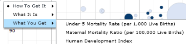
I was a bit surprised to see that all variables are accessed through one of three categories: definitions of "Quality of government (QoG)", causes of QoG and consequences of QoG.
Who needs identification strategies now?
